Font comparison and review: Atkinson Hyperlegible Mono
Published: July 22nd, 2025
Updated: July 25th, 2025
Recently, I modified anthes.is to use my own subsetted
versions of Atkinson Hyperlegible Next and
Atkinson Hyperlegible Mono. Following the principle of eating your own
dog food, I
also switched to Atkinson Hyperlegible Mono in my terminal. After a
month of daily use, I can now assess this font’s practical advantages
and compare it to established programming fonts like JetBrains Mono and
Fira Code.
Download links:
- Google Fonts GitHub repository (recommended)
- Official download link (requires email and EULA)
- Nerd Fonts release that added Atkinson Hyperlegible Mono
Table of contents
- On character distinction and readability
- About the Atkinson Hyperlegible font family
- The Atkinson Hyperlegible family’s unique design features
- Comparison to JetBrains Mono and Fira Code
- Installation and configuration
- Caveats
- Other resources
- A note on licensing
On character distinction and readability
Understanding Atkinson Hyperlegible Mono’s strengths requires examining
the readability challenges programming fonts must address. While many
fonts distinguish between 0 and O, or 1, l, and I, these
represent only two of many cases where character distinction matters.
Typographers call lookalike characters “homoglyphs.” The examples below showcase both homoglyphs and “mirror image” glyphs. Screenshots in this section come from Evaluating Fonts: Font Family Selection for Accessibility & Display Readability.
Multi-character homoglyphs
Multi-character homoglyphs occur when a sequence of glyphs appear to
form a single character. For example, cl can resemble d. Monospace
fonts reduce this problem, since each character occupies equal
horizontal space.
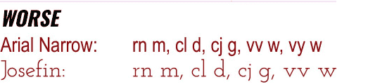
In the “worse” example, letters blend together to resemble different
characters. The “better” examples use subtle details to prevent
this—like Convergence’s curly y and Quando’s serifs.
Single character homoglyphs
Single character homoglyphs occur when one glyph resembles
another—such as 8 and B.
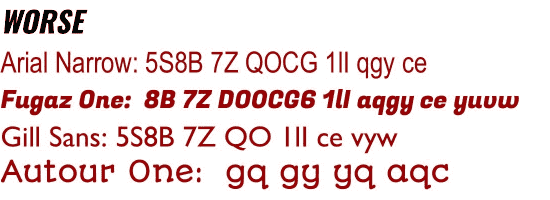
Several problems emerge in the “worse” examples.
- In Fugaz One, the
Oand0appear indistinguishable. Nearly the same applies tou,v, andw. - The
1,l, andIlook identical in Gill Sans.
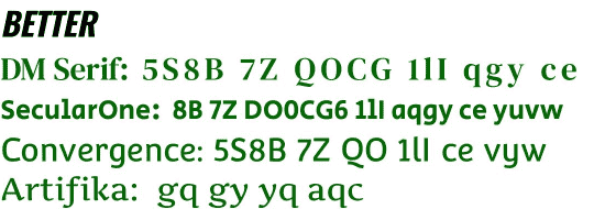
The “better” examples address these concerns through deliberate design
choices. SecularOne uses a circle for O and an oval for 0, while the
u, v, and w maintain distinct shapes.
Mirror image glyphs
Mirror image glyphs occur when flipping one character creates
another—like d and b. Serif fonts address this by adding
distinguishing serifs, but sans-serif fonts must find other solutions.
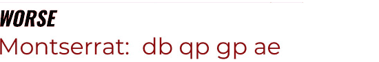
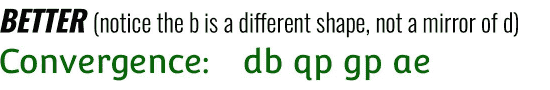
Montserrat achieves visual harmony, but creates mirror images.
Convergence solves this with a curly q tail and asymmetrical spurs
that distinguish d from b.
Scenarios where character distinction matters
Character distinction proves important in several scenarios:
- Debugging the results of a Structured Query Language (SQL) query, like
SELECT * FROM users WHERE id = 'B510', only to realize you meantSELECT * FROM users WHERE id = '8510'. - Copying hexadecimal output by hand from an airgapped machine. Or writing down GNU Privacy Guard (GPG) key fingerprints down on paper.
- Distinguishing between similar commit hashes when cherry-picking or
reverting in git, such as
a1c4e8bversusa1c4e8d. - Command-line flags, like
-1and-l.
These examples illustrate that visual distinctiveness proves important in many situations. Still, some questions remain: what informed Atkinson Hyperlegible’s design process, and what makes Atkinson Hyperlegible Mono special compared to other programming fonts?
About the Atkinson Hyperlegible font family
The Atkinson Hyperlegible family comes from the Braille Institute. Approaching their centennial in 2019, the institute hired Applied Design Works to develop a new brand identity. Applied Design Works needed a font that balanced character differentiation with visual harmony. When existing fonts failed to meet their specific accessibility and branding requirements, they designed their own, naming it after the institute’s founder: J. Robert Atkinson.
Atkinson Hyperlegible earned Fast Company’s 2019 Innovation By Design award. By 2025, Atkinson Hyperlegible generated over 43 million weekly impressions via Google Fonts. The Braille Institute then released enhanced versions: Atkinson Hyperlegible Next and Atkinson Hyperlegible Mono.
The Next variant of Atkinson Hyperlegible expands from 2 to 7 weights and extends language support from 27 to 150+ languages. The Mono version addresses what the Braille Institute called “one of the most requested additions”—a variant for developers.
The Atkinson Hyperlegible family’s unique design features
The Braille Institute, Applied Design Works, and Material Design all detail these design features. Since visual examples showcase typography better than descriptions, this article includes images from Material Design’s blog post.
Annotated images show the proportional version. Where the monospace version differs significantly, non-annotated comparison images follow.
Distinct silhouettes
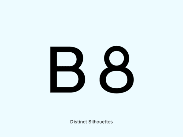
The B features two bowls of different sizes while the 8 combines a
small circle atop a larger oval.
Enhanced letterforms
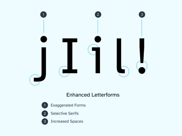
This image highlights several enhancements: the j features an
exaggerated tail, the I gains horizontal top and bottom bars, the i
and l get serifs, and the ! increases spacing between its dot and
vertical stroke.
Since these specific glyphs differ significantly between versions, here’s the monospace variant for comparison:
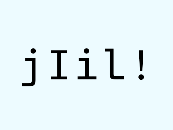
Key differences include:
- The
jandlgain longer feet and leftward serifs. - The
Iextends its horizontal bars. - The
iadds a horizontal bottom and longer leftward serif.
Asymmetrical spurs and exaggerated descenders
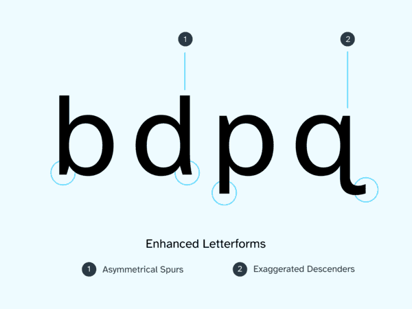
The designers used two techniques to distinguish mirror image glyphs:
- Asymmetrical spurs distinguish
bandd—thedfeatures a thicker spur that juts out more. - Exaggerated descenders separate
pandq—theqextends out into a longer, sweeping tail.
Comparison to JetBrains Mono and Fira Code
How does Atkinson Hyperlegible Mono compare to established programming fonts like JetBrains Mono and Fira Code? While many monospace fonts target readability, direct comparison reveals Atkinson Hyperlegible Mono’s specific advantages.
This comparison focuses on legibility features rather than stylistic preferences or minor aesthetic differences.
Single homoglyphs comparison
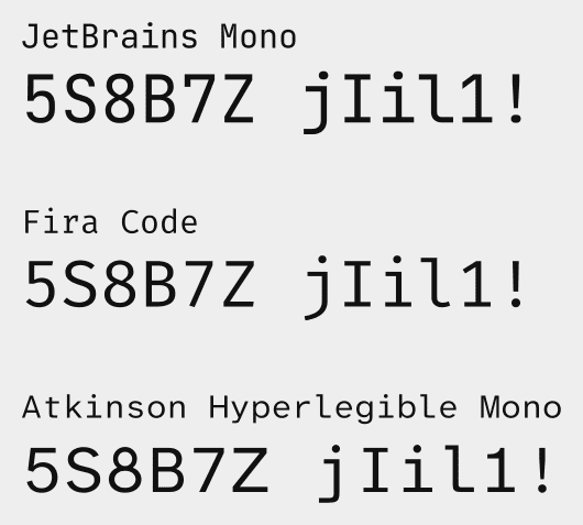
These fonts appear nearly identical at first glance, requiring closer examination to spot the differences.
- JetBrains Mono adds a serif to the
7to distinguish it from theZ. - Fira Code uses a curved hook on the
jand smaller curved serif on thel, distinguishing them within thejIil1!group. - Atkinson Hyperlegible Mono provides the strongest distinction between
8,B,5, andS. Thejandlfeature asymmetrical serifs, while the5uses a diagonal rather than vertical downstroke.
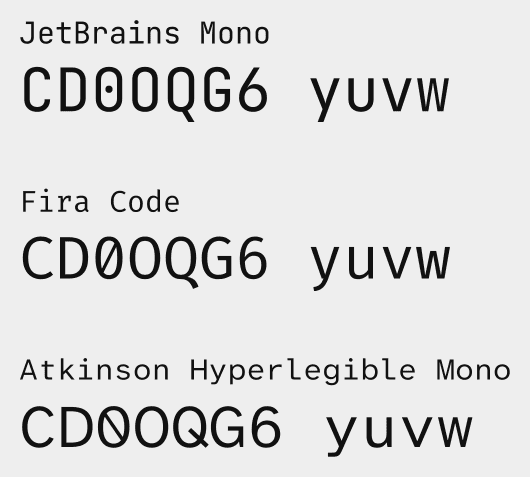
Here the differences become more apparent.
- JetBrains Mono struggles with
0,O, andQsimilarity, thoughGand6maintain good distinction.yandvappear more similar than in other fonts. - Fira Code’s
0andOdistinguish themselves through a slash and width variation, butGand6appear similar. - Atkinson Hyperlegible Mono excels in this comparison. The
Qfeatures a distinctive middle line, while the0uses a reverse slash to avoid confusion with the null sign in math and the slashedOin Danish/Norwegian.
Mirror glyphs comparison
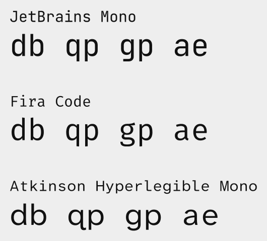
- JetBrains Mono provides the least distinction, with
d,b,q, andpappearing as true mirrors. Theaandealso show similarity. - Fira Code provides subtle distinction between
d,b,q, andp, though noticing the differences requires close examination. Thegandpface the same way, and thegappears more ornate.aanderemain distinct. - Atkinson Hyperlegible Mono achieves the strongest distinction between
d,b,q, andpthrough its asymmetrical design features. Theaandealso maintain clear differentiation.
Programming symbols comparison
![Font comparison showing programming symbols '\(\)\[\]\{\}\`\'":;.,'
across JetBrains Mono, Fira Code, and Atkinson Hyperlegible
Mono.](/images/programming_symbols_comparison_brackets.6e80af20e769a438d1d180152361408ef1f88cd42dad2157d69d1ac7990c9b17.png)
The programming symbols comparison reveals interesting trade-offs for Atkinson Hyperlegible Mono.
- JetBrains Mono excels at distinguishing
.from,and:from;. Ditto for(),[], and{}. - Fira Code also handles
(),[], and{}well. - Atkinson Hyperlegible Mono shows weaker
[]and{}distinction.
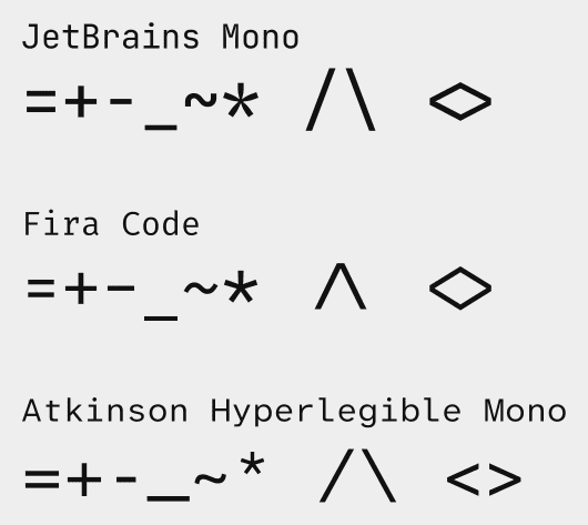
- JetBrains Mono maintains consistent horizontal length for
+and=, but shortens-relative to those operators. - Fira Code uses uniform length for
+,=, and-.-and_share similar length. The/\characters join together and render smaller compared to the other fonts. - Atkinson Hyperlegible Mono varies all operator lengths for
distinction. The
-and_show great differentiation, while*reduces in size and ascends above+for clarity. The<>characters remain separate rather than joining.
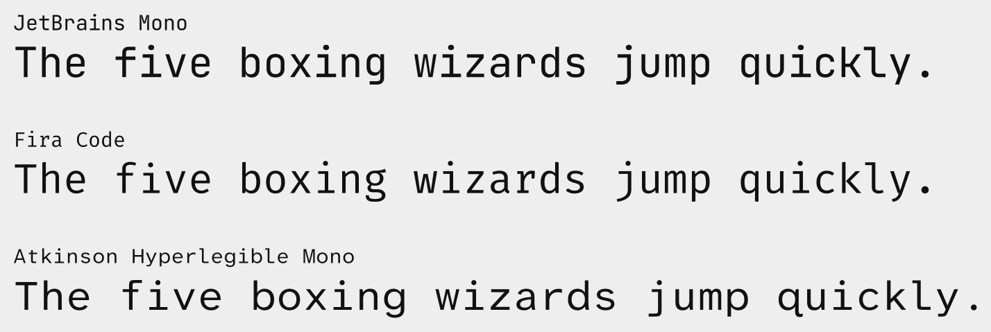
Alphabet comparison
Installation and configuration
These instructions apply to Unix-like operating systems. In other words: Linux, Berkeley Software Distribution (BSD) derivatives, and other similar operating systems.
While the Braille Institute offers direct downloads, they require email registration and End User License Agreement (EULA) acceptance for an open source font. Open source repositories provide a better alternative.
Make sure you have git installed and available, then clone the
googlefonts/atkinson-hyperlegible-next-mono repository on Github.
$ git clone https://github.com/googlefonts/atkinson-hyperlegible-next-mono
Create the ~/.local/share/fonts directory.
$ mkdir -p ~/.local/share/fonts
Install Atkinson Hyperlegible Mono in ~/.local/share/fonts.
$ cp ./atkinson-hyperlegible-next-mono/fonts/ttf/*.ttf ~/.local/share/fonts/
Build font information cache files.
$ fc-cache -fv
Configure Atkinson Hyperlegible Mono as your default monospace font system-wide and per application. The Arch Wiki’s font configuration guide covers system-wide setup. Terminal emulators and code editors typically set font through settings menus or configuration files.
Caveats
- Some versions of Atkinson Hyperlegible Mono don’t include the backtick/grave symbol.
- Applied Design Works specializes in branding rather than typeface design.
- Max Kohler’s development notes indicate Applied Design Works focused primarily on readers with vision difficulties rather than readers with dyslexia, though they expect the accessibility features to benefit both groups.
- The font’s commercial origins and the creators’ branding incentives may influence legibility claims.
- Atkinson Hyperlegible Mono lacks programming ligature support.
- Legibility claims lack peer-reviewed research support. While Atkinson Hyperlegible performed well in the Readability Group Survey, this measured preference rather than objective performance. Internal testing used vision simulation and reading metrics, but independent scientific validation remains absent.
Other resources
- Pimp My Type offers reviews of both the original Atkinson Hyperlegible and Atkinson Hyperlegible Next, as well as font pairing guidance.
- My bookmarks page contains links related to typography, legibility, and fonts.
- Coding Font hosts a dedicated page for Atkinson Hyperlegible Mono. You can compare fonts side-by-side there.
A note on licensing
The Braille Institute and the designers they collaborated with released the Atkinson Hyperlegible fonts under the SIL Open Font License, version 1.1. The website links to a license that reserves “ATKINSON” and “HYPERLEGIBLE” as Reserved Font Names. Anyone that modifies the font must remove those words from the name and metadata. Subsetting counts as modification in many cases.
Since I subset these fonts for performance reasons, I named the derivative versions “Anthesis Legible Sans” and “Anthesis Legible Mono” to honor the license.